

Security data can become difficult to understand when alerts, logs, and reports are scattered across different systems. That is why many organizations now focus on visualizing security metrics dashboard information in a clearer and more organized way. Dashboards help teams monitor threats, track performance, and identify risks faster through simple visual data.
From our experience, clear visualization improves decision-making and reduces confusion during security operations. In this article, we will explore the most important dashboard metrics and why visualization matters. Keep reading to learn more.
Dashboard Insights That Matter Most
Security dashboards help businesses understand threats faster and manage security operations more efficiently. The right visualization can simplify complex data and improve daily monitoring.
- Real-time monitoring improves threat visibility
- Visual dashboards simplify complex security data
- Incident tracking supports faster response management
Why Security Metrics Visualization Matters
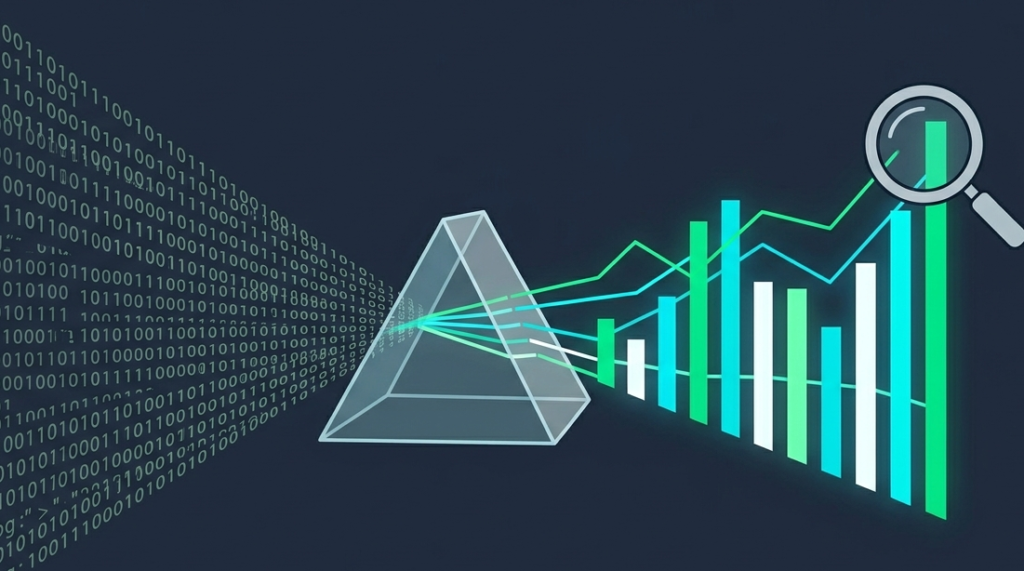
A security dashboard is designed to simplify complex cybersecurity information. Instead of reading long technical reports, teams can quickly understand risks through charts, graphs, and real-time indicators.
“Information visualization and visual analytics are essential to leverage the unique perceptual capabilities of humans in concert with algorithmic support to better comprehend complex cyber environments.” – IEEE Computer Society / ACM (Staheli et al.)
Benefits Businesses Often Notice
- Faster threat detection
- Easier reporting for management
- Better visibility across systems
- Improved response coordination
Many organizations struggle when security data is too technical or disconnected. Visual dashboards solve this problem by presenting information in a way that is easier to understand and act on. MSSP Security solutions often focus on simplifying data visibility without overwhelming users.
Real-Time Threat Monitoring Dashboard
Deploying a dedicated real-time security monitoring dashboard is one of the most important parts of visualizing security metrics across an organization. Security teams need immediate visibility when suspicious activity happens.
Common Metrics Displayed
- Active threat alerts
- Failed login attempts
- Malware detections
- Unusual network activity
Most dashboards use graphs, color indicators, and timelines to make threat activity easier to track. From what we have seen, businesses respond faster when alerts are visually prioritized instead of buried inside logs or spreadsheets.
Incident Response and Resolution Metrics
Credits: Next Gen Templates
Dashboards also help teams monitor how security incidents are handled. This improves accountability and response efficiency.
| Security Metric | Purpose | Business Benefit |
| Incident Volume | Tracks total incidents | Measures security workload |
| Response Time | Measures reaction speed | Improves efficiency |
| Resolution Rate | Tracks resolved cases | Reduces ongoing risks |
| Escalation Status | Shows critical cases | Better incident management |
Visual tracking helps organizations quickly identify delays or unresolved issues. Teams can understand incident progress without manually reviewing separate systems.
Vulnerability and Asset Visibility
Organizations often manage hundreds of devices, users, and cloud assets. Standard centralized consoles rely on common mssp security dashboard features to provide unified visibility for monitoring vulnerabilities and system health.
Dashboard Features Often Included
- Endpoint monitoring
- Vulnerability severity charts
- Device health summaries
- Asset inventory tracking
We have noticed that companies with stronger asset visibility usually identify weak points earlier. Clear visualization helps administrators focus on high-risk systems before problems become larger security incidents.
Compliance and Reporting Visualization
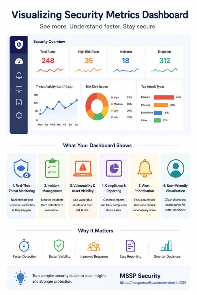
Many businesses must regularly provide security reports for audits, management reviews, or compliance requirements. Utilizing built-in reporting dashboard features simplifies this process through automated visual reporting.
“A contemporary Security Operations Center unifies multiple protective workflows into an integrated posture that manages log analysis, threat detection, incident response, and compliance reporting simultaneously.” – IEEE Access (Khayat et al.)
Common Reporting Elements
- Compliance scorecards
- Risk trend graphs
- Audit-ready summaries
- Security performance metrics
Instead of manually collecting information from multiple tools, teams can generate reports directly from the dashboard. MSSP Security environments often prioritize reporting visibility because simplified reporting saves time and improves operational clarity.
Alert Prioritization and Automation
Large organizations may receive thousands of alerts every day. Without proper visualization, important threats can easily be missed.
Features That Improve Alert Management
- Risk-based prioritization
- Automated alert filtering
- Threat severity indicators
- Suggested response actions
Visual prioritization helps analysts focus on the most serious risks first. In our experience, dashboards become much more effective when they reduce unnecessary noise and highlight actionable threats clearly.
Designing a User-Friendly Security Dashboard
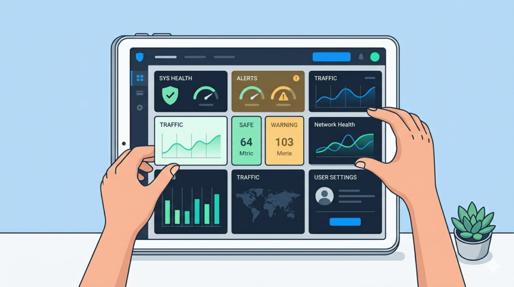
A dashboard should not only display data but also make information easy to understand for both technical and non-technical users.
Good Dashboard Design Usually Includes
- Clean layouts
- Simple navigation
- Interactive charts
- Easy-to-read summaries
Businesses often prefer dashboards that balance detailed metrics with simplicity. Overcomplicated dashboards can slow decision-making instead of improving it. Effective visualization focuses on clarity, speed, and usability.
FAQ
What is a security metrics dashboard?
A security metrics dashboard is a platform that visually displays cybersecurity data such as threats, incidents, vulnerabilities, and system performance.
Why is dashboard visualization important in cybersecurity?
Visualization helps teams understand risks faster, prioritize threats, and make quicker security decisions.
What metrics are commonly shown on security dashboards?
Common metrics include active threats, incident response times, vulnerability severity, compliance status, and endpoint activity.
How do dashboards improve security operations?
Dashboards centralize security information, reduce manual reporting, and help teams respond to incidents more efficiently.
Turning Security Data Into Clear Insights
Visualizing security metrics dashboard data helps businesses improve visibility, simplify reporting, and respond to threats more effectively. Clear dashboards make complex security information easier to understand for both analysts and management teams.
Features like real-time monitoring, vulnerability tracking, and automated reporting support faster and smarter decisions. At MSSP Security, we help organizations optimize security visibility and reduce operational complexity through effective security consulting and dashboard strategies.
References
- https://dl.acm.org/doi/10.1145/2671491.2671492
- https://ieeexplore.ieee.org/document/10387555