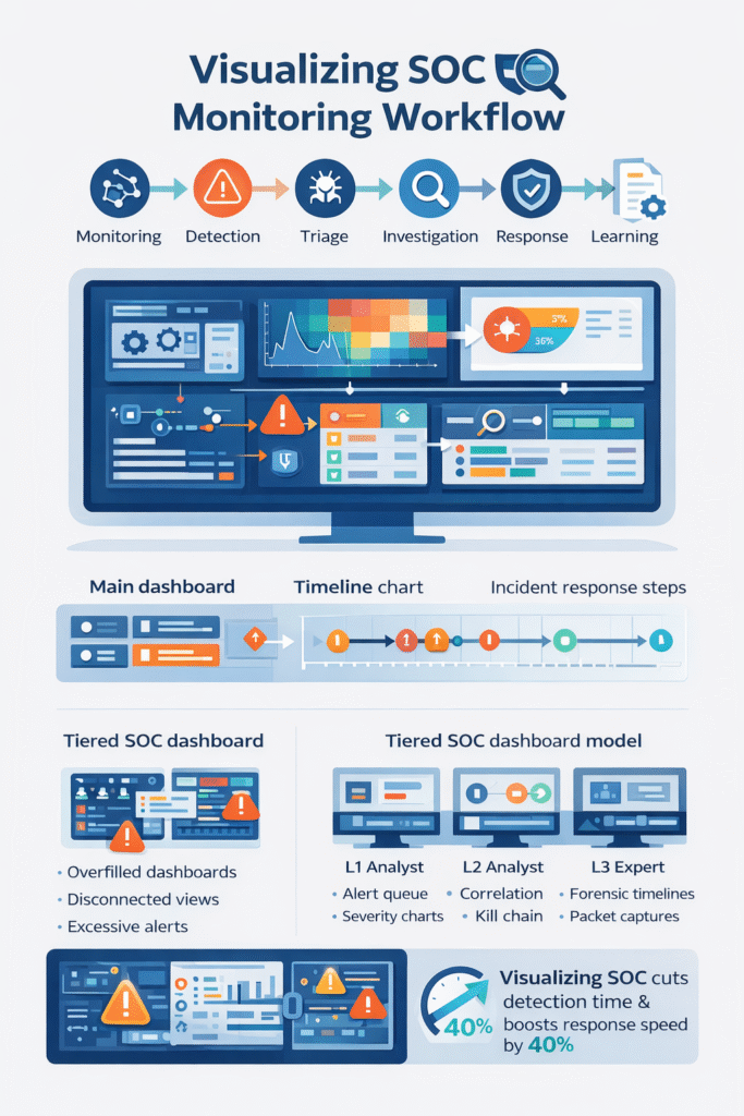
Visualizing SOC monitoring workflow means mapping how security alerts move from the first signal to the final fix. We use dashboards, graphs, and flow charts to make that path visible so analysts can track alerts and respond faster. Most SOC teams face heavy data flow.
IBM reports companies review millions of daily events before spotting a real incident. A strong SOC monitoring dashboard turns scattered logs into a clear story. In our work, we’ve seen teams slow down in noisy data. After adding visualization, coordination improves quickly. Keep reading to see how the workflow visualization actually works.
SOC Workflow Snapshot: What Visualization Changes
Visualizing SOC monitoring workflow gives teams a clearer path from alert to response. The sections below highlight the main operational benefits.
- Seeing the workflow cuts detection time. Dashboards and maps point straight to the threat.
- A clear visual pipeline makes analysts more efficient. It guides them step-by-step from alert to action.
- This approach works well for managed teams. A shared visual workflow helps analysts follow the same playbook across environments.
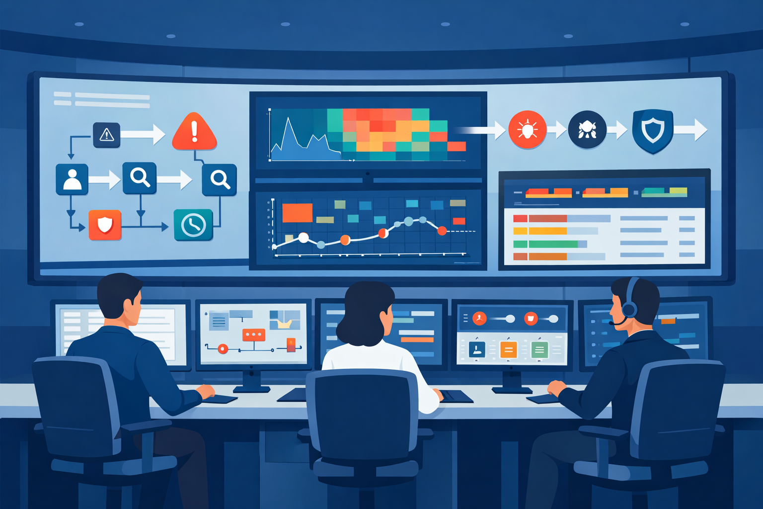
What Is a SOC Monitoring Workflow Visualization?
Think of a SOC monitoring workflow visualization as a map for security alerts. It shows where alerts come from, where they go, and how they get resolved.
Security tools suck in logs from everywhere, computers, networks, the cloud. The volume is staggering, often reaching terabytes each day. An analyst’s screen shouldn’t just be a wall of text. In most environments, this data follows a structured security operations center workflow where alerts move through monitoring, triage, investigation, and response stages.
We build SOC analyst interfaces that make sense of the chaos. You might see a log correlation view linking related events, or a network heatmap flashing red where something’s wrong. In our consulting for MSSPs, we’ve seen the “aha” moment. When a threat detection flowchart replaces a disconnected list, decisions come quicker.
A solid visualization stack usually has a few key parts:
- A main SOC monitoring dashboard for the live view.
- An alert management board that sorts by severity.
- An incident response timeline to track the investigation.
- An attack surface visual to see what’s exposed.
These layers let analysts act without jumping between ten different tools.
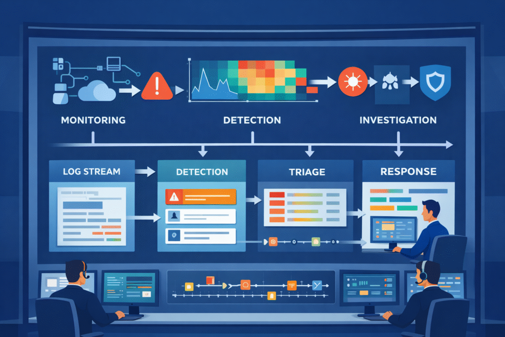
How the SOC Monitoring Workflow Progresses
Credits: RSA Conference
A standard SOC monitoring workflow has several stages that turn noise into a resolved ticket. It starts with constant watching. Data flows in from firewalls, endpoints, and cloud apps.
You might see this as a firewall log graph or an endpoint activity chart. These stages mirror the typical SOC workflow steps explained in many operational SOC environments. Where monitoring, detection, triage, and response follow a consistent process. It starts with constant watching. You might see this as a firewall log graph or an endpoint activity chart.
Next, the system tries to find threats. It looks for patterns and weird behavior. Frameworks like MITRE ATT&CK list over 200 techniques attackers use, giving us a cheat sheet for what to look for.
Then, alerts hit the triage queue. A good incident triage visualization helps sort real threats from false alarms by showing risk scores and context.
The process keeps moving:
- Continuous monitoring on the main dashboard.
- Automated detection with anomaly charts.
- Analyst triage and sorting.
- Investigation using a timeline.
- Containing and fixing the problem.
- Learning from it to tune the rules.
Looking at metrics charts for time-to-detect and false positives lets us make the next cycle smarter. Visualization makes that learning loop possible.
Visualization Types That Power SOC Dashboards
Different charts and graphs help make sense of the flood of security data. Some environments see over 10,000 events every second. Research shows the right visual can cut through that clutter during a crisis.
Insights from Security Intelligence indicate
“To be effective, SOC dashboards should incorporate visualization types like heat maps for geographic distribution and treemaps for understanding the relative size of different alert categories, allowing analysts to distinguish between normal noise and legitimate threats at a glance.” – Security Intelligence
Here are the types we use most often:
- Line Graphs: To track trends, like alert volume over a week.
- Heatmaps: To spot concentrations of risk or attack points.
- Timelines: To see how an attack unfolded step-by-step.
- Kanban Boards: To track an incident’s status, from open to closed.
- Network Graphs: To map how an attacker moved through systems.
You’ll find these in a cybersecurity analytics panel. A typical dashboard might combine a network security heatmap, an endpoint detection spike graph, and a live threat intelligence feed.
In our work, we’ve learned simple is better. If a dashboard instantly shows the attack path and what’s affected, the analyst knows what to do. Clear visuals beat a screen packed with numbers every time.
Why Many SOC Dashboards Fail in Real Operations
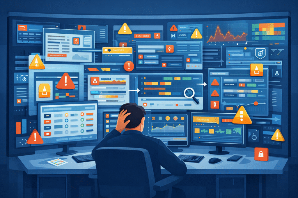
Lots of SOC dashboards fail because they’re too busy. They show too much and help too little, which overwhelms the team.
Alert fatigue is a real problem. Studies suggest teams ignore more than half of all alerts because there are just too many, and many are false alarms. This happens with cluttered dashboards that mix packet capture graphs, log visualizations, and anomaly charts with no clear focus.
We see a few common mistakes:
- Dashboards crammed with widgets and gauges.
- No way to click and drill down into an alert.
- Rules that create a flood of false positives.
- Separate, disconnected views for network, cloud, and endpoint data.
Supporting MSSPs, we often find teams with flashy dashboards that collapse under real attack pressure. A good visualization drives action. An analyst should see the breach timeline, the compromised asset, and the lateral movement path right away, no digging required.
Tiered SOC Dashboard Models Improve Analyst Efficiency
A tiered SOC dashboard gives different screens to different team members. This keeps people focused on their specific job.
Big teams usually have three tiers of analysts. Each one needs a different view to work effectively. Research says this structure can slash response time by up to 40%. This layered structure is common inside an MSSP SOC workflow where multiple analysts collaborate across different investigation stages.
Here’s how we break it down:
| Tier | Their Job | What Their Dashboard Shows |
| L1 Analyst | First alert check | Alert queue, severity charts, simple validation tools |
| L2 Analyst | Digging into incidents | Timelines, correlation graphs, kill chain diagrams |
| L3 Expert | Deep forensic work | Packet analysis, detailed network maps, attacker profiling |
An L1 screen might have a phishing alert board and a ransomware detection panel. L2 analysts then use correlation maps and privilege escalation diagrams. L3 experts live in forensic timeline tools and packet capture graphs.
Running our own operations, this layered approach keeps things clean. Analysts see only what they need, which makes them much faster. Efficiency jumps when the visual tool fits the task.
Designing a Clear SOC Monitoring Workflow Diagram
A good SOC monitoring workflow diagram lays out the whole security process, from data sources to response playbooks. It’s the blueprint for your operation.
As noted by EC-Council Blog
“A SOC workflow diagram should map out the entire incident response process, from the moment an alert is triggered to the final remediation steps, ensuring that the transition between automated detection and manual analysis is clearly defined to prevent bottlenecks.” – EC-Council Blog
It usually starts with data pouring in, firewall logs, cloud security views, and access reports. We follow two simple rules when drawing these: keep it simple, and match the picture to the actual work people do.
Most of our diagrams have five stages:
- Collecting and ingesting data.
- Correlating and enriching events.
- The analyst triage workflow.
- Automated incident response.
- Reporting and learning for next time.
Each stage has its own tools, like threat hunting canvases or playbook execution graphs. Mature setups add layers like user behavior analytics dashboards and AI anomaly charts.
We often map these stages to the MITRE ATT&CK framework, so analysts can tie an alert to a known hacker tactic. For the MSSPs we consult with, these diagrams create a common language. The visualization itself becomes the standard operating procedure.
FAQ
How does a SOC monitoring dashboard improve real-time security monitoring?
A SOC monitoring dashboard helps analysts watch alerts, logs, and system activity in one place. Instead of reading long lines of raw data, teams see patterns through clear visuals. A dashboard may include a security event dashboard, an endpoint detection graph, and a network security heatmap.
These visuals support real-time security monitoring by showing unusual behavior quickly. Analysts can spot problems earlier and respond before threats spread.
What role does a SIEM workflow diagram play in SOC operations?
A SIEM workflow diagram shows how security data moves through detection, analysis, and response in a SOC. It explains how logs become alerts and how incidents move toward resolution.
Teams often pair the diagram with a log correlation visualization, an incident response timeline, and a threat detection flowchart. These visuals help analysts understand each step of the process and investigate security alerts in a more organized way.
How does incident triage visualization reduce false positives?
Incident triage visualization helps analysts review alerts and decide which ones require attention. Instead of reading many raw alerts, teams use visuals such as a risk scoring heatmap, a severity level pie chart, or an alert management dashboard.
These tools show risk levels clearly. Analysts can focus on real threats and ignore harmless alerts. This process supports false positive reduction and improves investigation speed.
Why is MITRE ATT&CK mapping useful in security operations center visualization?
MITRE ATT&CK mapping helps analysts connect alerts to known attacker behaviors. In a security operations center visualization, teams can link activity to tactics such as privilege escalation or lateral movement.
Analysts often view these behaviors through a cyber kill chain diagram, a lateral movement graph, or a privilege escalation map. This context helps security teams understand attacker intent and decide how to respond.
What visual tools help analysts track threat investigations over time?
Security teams track investigations with visuals that show how an incident develops. An incident response timeline shows each step during the investigation. A breach detection timeline shows when suspicious activity started.
Teams also review metrics such as an MTTR trend graph and an MTTD metrics chart. Analysts may combine these visuals with a threat intelligence feed and a forensic timeline tool to understand how threats were detected and resolved.
Make SOC Workflows Clear and Actionable
Alerts pile up fast, and when your screen is full of logs it’s hard to see what actually matters. You waste time digging through noise while threats keep moving. It’s exhausting. A clear SOC workflow helps your team move faster with better direction.
If you want practical help turning dashboards and timelines into daily tools, explore MSSP consulting for SOC workflow optimization. It’s a simple way to improve visibility and help analysts respond with confidence.
References
- https://securityintelligence.com/posts/how-to-build-an-effective-soc-dashboard/
- https://blog.eccouncil.org/how-to-build-an-effective-security-operations-center-soc/