You stare at the screen, a mosaic of green checkmarks and climbing graphs. It feels good. It looks healthy. But somewhere in your gut, a quiet doubt stirs. Is this really how we’re doing? That dashboard, with all its flashing lights, might just be telling you the story it wants you to hear, not the truth of your security posture.
We’ve seen it too often, teams chasing metrics that look impressive on a board but mean nothing in a real incident. Let’s strip away the decoration and talk about building a key performance indicators kpis dashboard that actually tells you something. Keep reading.
What You’ll Actually Gain
A KPI dashboard helps organizations understand important data faster and more clearly. Before exploring the details, here are a few key things to know:
- You’ll learn to distinguish between vanity metrics and security-critical KPIs.
- You’ll get a practical framework for building a dashboard that focuses on outcomes, not just activity.
- You’ll understand how to use this dashboard to drive conversations with leadership and improve your real-world security.
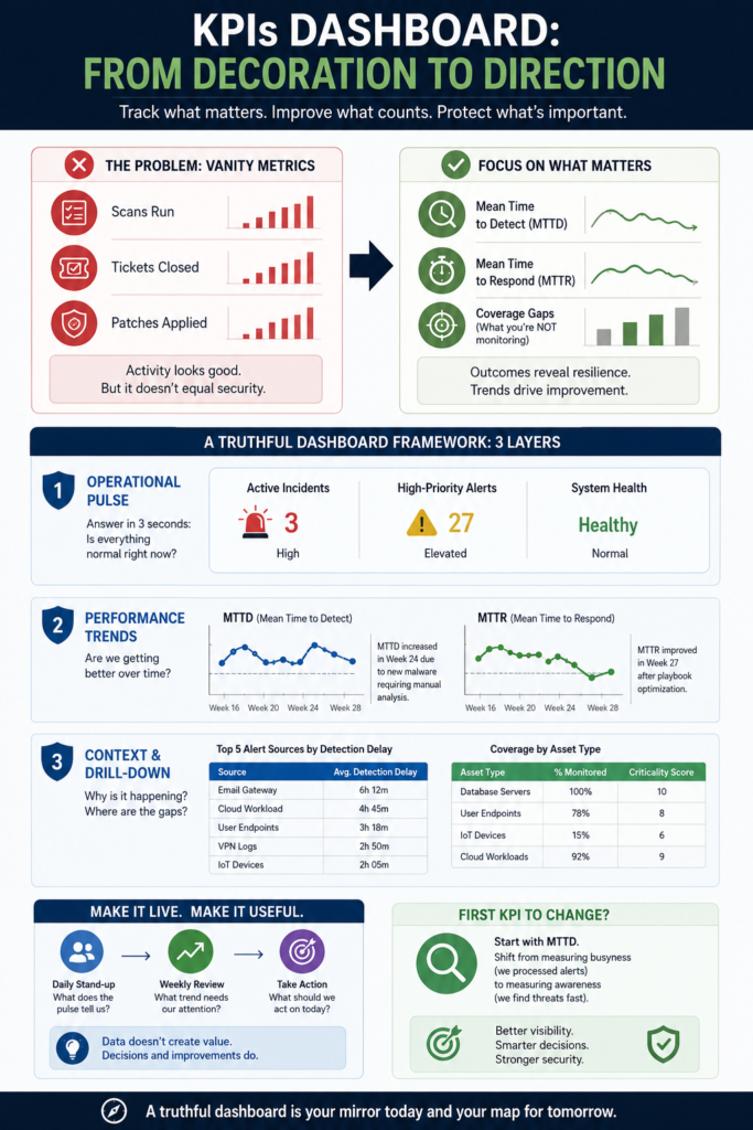
The Problem with Pretty Numbers
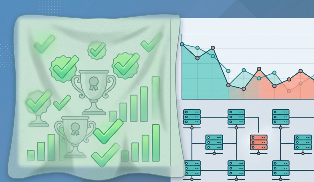
It starts innocently enough. You need to show progress, so you track things that are easy to measure: number of scans run, tickets closed, patches applied. The graphs go up. Everyone feels a sense of motion. But motion isn’t always progress.
A high number of closed tickets might just mean you’re efficient at handling low-priority noise. A perfect patch compliance percentage could be ignoring the one critical server that’s still vulnerable. The dashboard becomes a comfort blanket, not a compass.
We remember a client, years back, who proudly showed us a 99.9% “security health” score on their internal dashboard. A week later, they had a major data exfiltration incident. The health score measured configuration compliance, not detection capability or response readiness.
“Traditional security metrics often focus heavily on compliance and activities rather than actual effectiveness, leading to a false sense of security.” – ResearchGate
So, what should you track instead?
Credits: For Purpose Live
- Mean Time to Detect (MTTD): How long from an event starting to you knowing about it.
- Mean Time to Respond (MTTR): How long from knowing about it to containing it.
- Coverage Gaps: Not just what you’re monitoring, but what you’re not monitoring, and how critical those assets are.
These aren’t always pretty. Their graphs might dip. They tell harder stories. But they’re stories about your actual security resilience.
Building a Truthful View: A Framework
You can’t just throw these new KPIs on a screen and hope it works. The layout, the context, and the flow of information must support a single goal: understanding your posture at a glance. When mapping out common mssp security dashboard features, we think about organizing the data in three specific layers.
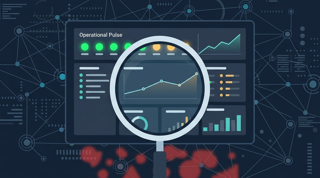
The First Layer: Operational Pulse
This is the top section, what you see in the first 3 seconds. It should answer one question: “Is everything normal right now?” It’s not for deep analysis. It’s a status light. Think current incident count, high-priority alert volume, and critical system health. One row. Three numbers. Green, yellow, or red.
The Second Layer: Performance Trends
Here’s where your key KPIs live, like MTTD and MTTR. Show them over time, 30 days, 90 days. Use line graphs. The goal is to see if you’re getting faster, or if a new control is slowing you down.
Next to each graph, put a single, plain-text explanation for any major spike or dip. “MTTR increased in Week 24 due to novel malware requiring manual analysis.” That’s all. No jargon.
The Third Layer: Context & Drill-Down
This is the space for the supporting data. If your MTTD is trending up, what’s causing it? This layer might list the top 5 alert sources with the longest detection delays. When visualizing security metrics on a dashboard, a simple table showing coverage by asset type can quickly pinpoint blind spots.
| Asset Type | % Monitored | Criticality Score |
| Database Servers | 100% | 10 |
| User Endpoints | 78% | 8 |
| IoT Devices | 15% | 6 |
A table like this moves the conversation from “we monitor 80% of things” to “we’re missing 22% of our high-risk endpoints.”
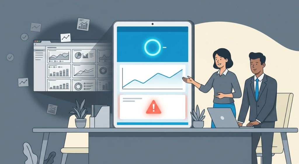
Making the Dashboard Live and Useful
A static dashboard is a report. A living dashboard is a tool. The difference is in how it’s used and who uses it. It shouldn’t just sit on a wall monitor; maximizing your mssp reporting dashboard features means making it the starting point for daily stand-ups and weekly leadership reviews.
The questions change from “Did we do our tasks?” to “Are we getting better at protecting the business?”
We’ve found that the most effective dashboards are those tied directly to a recurring conversation. At MSSP Security, our team uses a shared dashboard view every morning. The first question isn’t about the numbers.
“The value of a security dashboard does not lie in the data displayed, but in the operational decisions and continuous improvements it facilitates.” – Link.Springer
It’s, “What does the pulse tell us about yesterday?” Then, “What trend needs our attention this week?” Finally, “What drill-down item should we act on today?” The dashboard feeds the discussion, not the other way around.
This approach turns data into decisions. A rising MTTR trend triggers a review of response playbooks. A coverage gap in high-criticality assets triggers a project to extend monitoring. The dashboard stops being a passive display and starts driving active security improvement. That’s its real job.
Common Hurdles (And How to Clear Them)
You’ll hit resistance. People like their green checkmarks. Leadership might ask for that “health score” back. Here’s how we’ve navigated that.
They say: “This new dashboard looks worse. The numbers are lower.”
You explain: “It’s more honest. The old score hid our weaknesses. Now we can see them, and that means we can fix them. Fixing a real problem is better than celebrating a fake score.”
They ask: “Can’t we just add these new KPIs to the old pretty dashboard?”
You advise against it. The old dashboard’s design, its colors, its layout, was built to emphasize the vanity metrics. Adding truth to a frame built for decoration just makes the truth look like an outlier. Start fresh. Build a new view dedicated to the meaningful story.
They worry: “It’s too technical for my leadership reports.”
That’s fair. So you build a derivative view. From your detailed technical dashboard, you automate a one-page summary.
For leadership, that page might just show three things: 1) Are we currently under attack? (No.), 2) Are we responding faster than last quarter? (Yes/No.), 3) What is our single biggest risk right now? (Coverage gap on X.). You keep the deep dashboard for the operational team, and you extract the executive narrative from it.
FAQ
How many KPIs should be on the main dashboard?
You’ll want to fight the urge to fill every pixel. It’s a common instinct, a desire to show the whole picture. But the main screen is for navigation, not the encyclopedia. We’ve found that 5 to 7 core metrics is about right.
If you’re pushing past ten, you’re likely mixing in activity logs, things like “number of alerts generated”, with outcome measures. Each KPI on that main view should force a distinct decision. If two metrics tell you the same story, one of them is redundant. It’s about clarity, not completeness.
Do I need special software to build this?
The tool can become a distraction. We’ve watched teams spend months debating platforms while their actual security posture drifted. Start with the simplest thing that works. A well-structured spreadsheet with a few pivot charts can reveal more truth than a poorly conceived enterprise dashboard.
The philosophy, tracking outcomes over activity, is the critical part. Get that logic cemented in your team’s thinking. Once you know what you truly need to see, choosing a tool becomes straightforward. The fancy software just automates a process you already understand.
How often should the data update?
This depends entirely on the layer. For the Operational Pulse, the top-level “status light,” you need real-time or near-real-time feeds. A delay there means you’re looking at history, not current state. For the Performance Trends layer, daily updates are usually sufficient.
You’re looking for patterns over weeks and months; a daily refresh gives you that line without the noise of minute-by-minute fluctuations. The Context layer can be updated weekly, as it’s used for deeper analysis and planning.
What’s the first KPI I should change?
Audit your current dashboard. Find the shiniest metric, the one that’s perpetually green and gets mentioned in every report. Then ask yourself: “When has this number ever directly caused us to change a procedure, invest in a new tool, or reallocate a person?” If the answer is “never,” that’s your target.
Swap it out. A good candidate for replacement is Mean Time to Detect (MTTD). It’s a fundamental shift. You move from measuring busyness (“we processed 10,000 alerts”) to measuring awareness (“we find threats within 2 hours”). It’s a harder number to get right, and its graph might be ugly, but it starts a real conversation about your detection capabilities.
From Decoration to Direction
A KPIs dashboard shouldn’t be a trophy case; it should be a truthful mirror and a map for what’s next.
Ready to build a dashboard that tells the truth? We offer expert consulting tailored for MSSPs to streamline operations, reduce tool sprawl, and optimize your stack. Backed by 15 years of experience, we guide your vendor selection and integration to align with your business goals.
Let’s focus on the outcomes that matter.
References
- https://www.researchgate.net/publication/381186831_Developing_Dashboard_Analytics_and_Visualization_Tools_for_Effective_Performance_Management_and_Continuous_Process_Improvement
- https://link.springer.com/chapter/10.1007/978-3-032-15233-6_15