

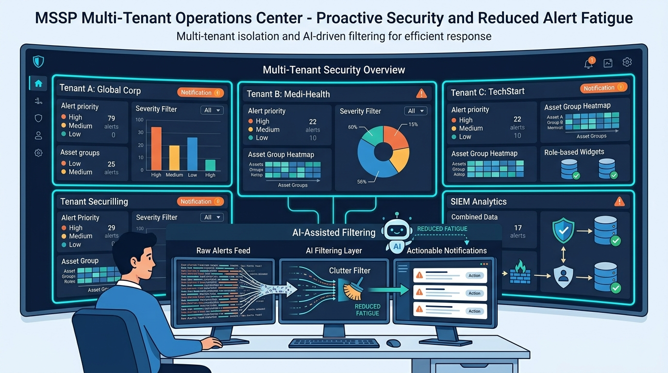
Customizing MSSP Dashboard Views helps MSSPs stop building dashboards clients ignore or cannot act on. Learn how to design actionable multi-tenant visibility for SOC teams, executives, and clients.
Most MSSP dashboards are cluttered and show vanity metrics, hurting their real use. A better plan, not more tools, is the fix. You need set views for SOC staff, account teams, and each client, with data clearly split. This structure builds clarity and cuts workload. To learn how to build these views, keep reading.
MSSP Dashboard Essentials at a Glance
Building good MSSP views is about giving the right view to the right users while keeping each client safe and clear.
- Our analysts on the front lines need fast queues to catch live hacks. At the same time, company heads just want clear scores to prove their systems match industry rules.
- We enforce strict path controls at the application layer. This step ensures a user from one firm can never view or intercept log data belonging to another business.
- Client dashboards should focus on important metrics. These include MTTR, detection categories, and security coverage gaps. Raw block and event totals are less important.
Common Failures in Modern MSSP Dashboard Environments
The “single pane of glass” promise is a nice idea, but it’s usually a pane of confusion. We’ve seen it firsthand. For MSSPs managing hundreds of clients, a single dashboard trying to serve everyone becomes useless. Analysts drown in unfiltered alerts, while clients get overwhelmed by technical data they don’t understand.
Clients often prefer distilled executive reports. They like email summaries better than daily live dashboards. Client size and maturity influence these preferences. Offer both self-serve portals and scheduled summaries.
“Researchers and practitioners warn that high volumes of low-signal alerts cause desensitization and alert fatigue; studies and vendor guidance recommend tuning and enrichment to reduce false-positive conditioning” – corelight.com
Best Practices for Multi-Tenant MSSP Dashboard Architecture
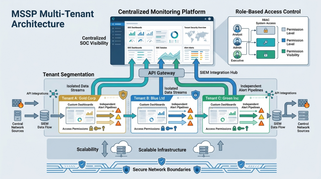
A good MSSP view is not its charts, but the data flow under it. You have to build it to keep client data strictly separate while letting your team see aggregated threats. It starts with RBAC, but goes deeper.
Our audits often reveal these critical layers aren’t distinct, which creates risk. Changing a dashboard for one client can inadvertently alter the schema for another. For MSSPs managing 100+ environments, that’s a real operational threat.
The system must split data at each step:
- Global SOC Views: Your internal team needs a view aggregating alerts from all clients.
- Single-Tenant Views: An isolated view for a specific client.
- Each client uses its own key to reach data.
- Database-Layer Segregation: True safety means data is separated at the storage level.
Essential Dashboard Views for SOC Analysts, vCISOs, and Executives
| Persona | Primary Goal | Required Widgets | Key Metrics |
| SOC Analyst | Fast triage | Alert queues, threat feeds | MTTA, severity distribution |
| vCISO | Value tracking | SLA dashboards, risk trends | MTTR, security score |
| Executive | High-level insight | Compliance scorecards | Risk score, threat summary |
Each of these depends on properly Customizing MSSP Dashboard Views to match decision-making needs.
Metrics That Matter More Than Vanity Data in MSSP Dashboards
High-performing MSSPs focus on reducing risk. They track SLA metrics. They also use behavioral detections. They don’t focus on inflated event counts.
A view with false numbers can mislead users. It creates false confidence for clients and wastes your analysts’ time. The shift is towards more structured Visualizing Security Metrics Dashboard approaches that reflect actual security outcomes and operational efficiency.
| Vanity Metric | High-Signal Alternative |
| Total Events / Logs Processed | Log Source Health & Coverage Gap |
| Millions of Blocks | Confirmed Threat Types Mitigated (Ransomware, Phishing, etc.) |
| Static Signature Match Count | Behavioral Anomalies Detected & Auto-Contained |
| Raw Alert Volume | Mean Time to Resolution (MTTR) & Closure Rate |
| “All Green” Status Lights | Compliance Control Implementation Progress |
Executives prefer these simplified, outcome-focused indicators. They prove value without requiring a technical deep dive.
Reducing Alert Fatigue Through Smarter MSSP Dashboard Design
Credits: ManageEngine IAM and SIEM
Alert fatigue isn’t just about too many alerts; it’s about poorly presented ones. SOC analysts working within a Real-Time Security Monitoring Dashboard handle thousands of alerts daily, and a dashboard must help them triage, not hinder them.
Start with a visual hierarchy: KPIs on top, trend charts in the middle, and detailed tables at the bottom. Within the alert queue, enforce severity-based sorting. A critical lateral movement attempt must visually dominate a low-priority warning.
Our work shows three design features reduce fatigue:
- Dynamic Filtering: Let analysts instantly filter by attack vector, geography, or asset criticality.
- Contextual SOP Links: Don’t just show the alert. Click it to open the relevant playbook directly.
- Automated Enrichment Visualization: Show which alerts have already been enriched, saving manual work.
“Dashboards must show exactly what employees and customers need to see.” –cymulate.com
One big problem is old data going out of date. We configure tools like Grafana with auto-refresh triggers, so analysts never work from outdated information.
Why Modern MSSPs Prefer Power BI and Grafana Over Built-In SIEM Dashboards
tandard SIEM views fail when you scale. If you tweak a layout for one account, you risk breaking the view for everyone else. Your team then spends hours fixing broken code instead of hunting threats.
We stream raw logs from client tools into a central cloud data store. A fast SQL query engine handles the heavy lifting, acting as the main source of truth. From there, Power BI pulls clean data points through direct API links without breaking tenant walls.
This approach trades the ongoing pain of brittle native tools for long-term control of a decoupled system.
Advanced Dashboard Features That Differentiate Premium MSSPs
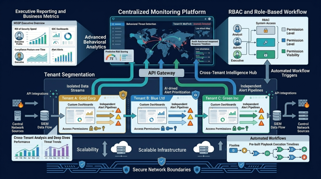
Beyond basic charts, advanced features turn a dashboard from a reporting tool into a strategic asset. These are the elements clients notice and that improve your team’s efficiency. We’ve seen them differentiate premium MSSPs.
- Benchmarking: Provide clients with anonymized insights. “How does your threat volume compare to similar-sized peers?”
- Dynamic Filtering: Go beyond simple filters. Let clients drill down by business unit or geography.
- White-Labeling: For client-facing portals, automatically apply the client’s logo and color scheme.
- Deployment Tracking: Show the exact percentage of endpoints running your security tools. This view flags gaps before a new client goes live.
- Our charts highlight rapid spikes in web traffic to strange web domains. This view proves your team spots stealthy threats that standard tools miss.
These custom panels deliver real business value. They provide clear data that helps your internal team and your clients make smart safety choices. Modern MSSPs also rely on Common MSSP dashboard features to standardize essential capabilities like role-based visibility, tenant isolation, and operational consistency across client environments.
Building Secure and Scalable Dashboard Templates for MSSP
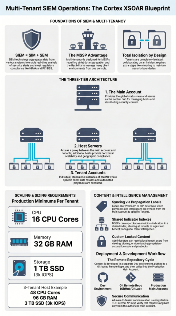
Building a dashboard for one client is a project. Building a template system that scales across hundreds is an architecture. We’ve seen template errors, where a widget accidentally references a global data source, exposing cross-tenant metadata. It’s a critical failure.
Our checklist for secure, scalable templates includes:
- RBAC Validation First
- API Token Isolation
- Responsive Layouts
- Widget Inheritance Controls
- Tenant-Safe Template Cloning
As you scale, this disciplined template management prevents onboarding from becoming a risk.
FAQs
How does MSSP dashboard customization improve SOC dashboard visibility?
Custom dashboards organize alerts and metrics into focused views, cutting through clutter. This gives SOC analysts a clearer picture of the security environment instantly.
How does SIEM dashboard customization improve threat detection performance?
Custom SIEM dashboards connect security events and simplify analytics. This cuts down on noise, letting analysts spot suspicious activity and confirm threats much more quickly.
How do incident response dashboards improve security triage workflows?
Incident response dashboards organize alerts into a single view. This helps teams prioritize the most dangerous threats and start investigating them right away.
How does multi-tenant dashboard design reduce SOC alert fatigue?
Multi-tenant dashboards keep each client’s data separate. This cuts down on overlapping alerts and noise, so analysts can focus on the real, high-priority threats.
How do compliance dashboards support executive and CISO security reporting?
Compliance dashboards give executives and CISOs a clear overview of security posture and risk levels. They simplify tracking status and make reporting straightforward for audits.
Build Dashboards People Actually Want to Use
When your MSSP dashboards are overloaded with noise, your analysts waste time digging through clutter while clients struggle to find what actually matters. That frustration adds up fast. A dashboard should help people work faster, not slow them down with endless widgets and meaningless metrics.
The smarter move is building dashboards around real operational value, clear tenant isolation, and reporting people can understand without extra explanation. That’s where MSSP Security can help, with practical guidance for scalable reporting architecture, tooling optimization, and SOC efficiency improvements that support long-term growth.
References
- https://cymulate.com/blog/dynamic-dashboards/
- https://corelight.com/resources/glossary/alert-fatigue