You’re drowning in alerts, fighting fires every day. But what if you could see which fires keep starting, and why? That’s what incident trend analysis reporting does. It moves you from reactive panic to proactive control.
This isn’t about more data, it’s about the right insight. By the end of this, you’ll know how to build a report that tells you exactly where to point your team next. Keep reading to turn your chaos into a clear action plan.
Turn Incident Data Into Your Next Security Win
Before you dive into the details, here are the most important lessons from incident trend analysis reporting:
- Stop reacting to every alert. Focus on recurring patterns instead of isolated incidents.
- Track what happens most often. Frequent attack vectors reveal where your defenses need improvement.
- Measure response performance. Metrics like resolution time help identify operational bottlenecks.
Your Roadmap Out of Alert Fatigue

Before we get into the details, here’s your quick guide. A good trend report does three things. It identifies your most common attack vectors. It highlights your slowest response times. And it proves the value of your security work to everyone else. Let’s break down how to make that happen for you.
“Organizations often fail to realize that a high volume of false positives or uncontextualized alerts directly degrades human analyst performance, leading to missed critical events. Standardizing incident metrics is crucial to filter out noise and surface systemic operational vulnerabilities.” – Wikipedia
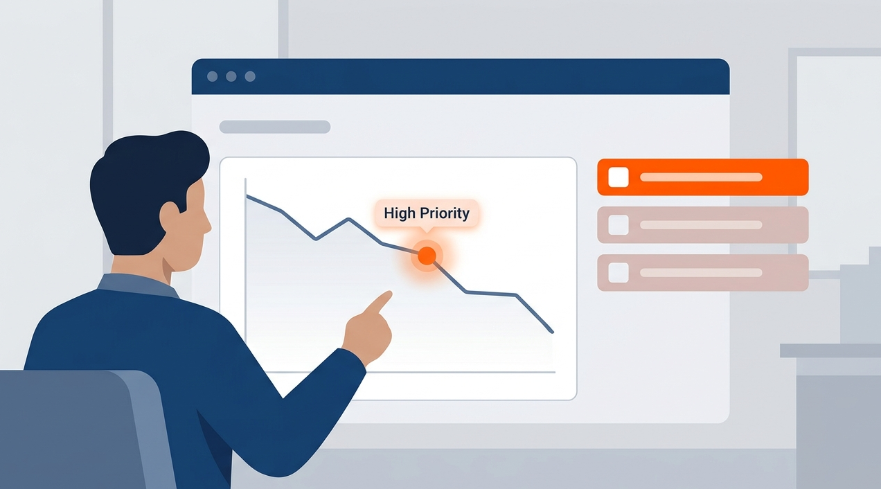
Seeing the Patterns in the Noise
You open your security console on Monday morning. Fifty new tickets. A dozen high-priority alerts. Where do you even start? This feeling, this overwhelming scramble, it’s the daily reality without trend analysis. You’re just reacting. The goal is to stop that cycle. To find the signal in all that noise.
We’ve been there, sorting through pages of logs at 2 a.m., looking for a connection that wasn’t obvious during the day. The human brain isn’t built to spot patterns across thousands of discrete events over months.
That’s a job for a consistent process. A simple weekly report, maybe just one page, can change everything. It forces you to look back, to compare. You start to see things. Like how phishing attempts spike every other Tuesday. Or that your development servers are constantly probed on port 22.
The process doesn’t need to be complex.
- Tally incident types (phishing, malware, unauthorized access).
- Note the source IP addresses, if you have them.
- Record the time to detection and time to resolution.
- Do this every week, in the same format.
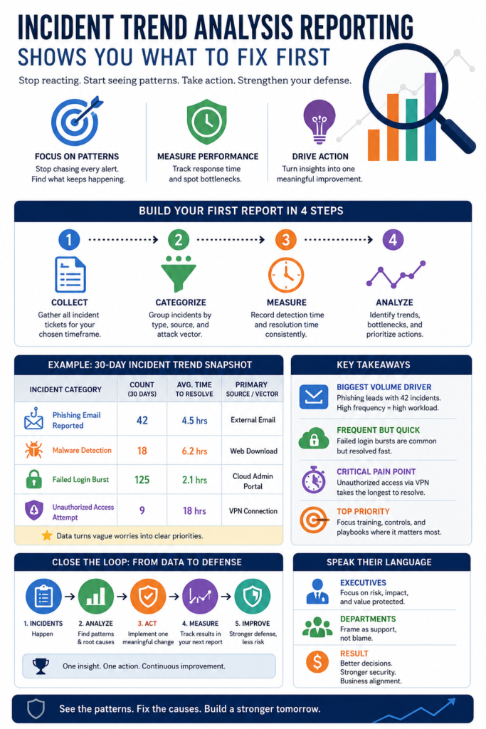
After a month, you have data. After a quarter, you have trends. Those trends tell a story about your vulnerabilities. They show you where your defenses are thin. More importantly, they show you where to spend your next security dollar. Is it on endpoint protection? User training? A tighter firewall rule set? The report points the way.
Building Your First Report: A Practical Guide
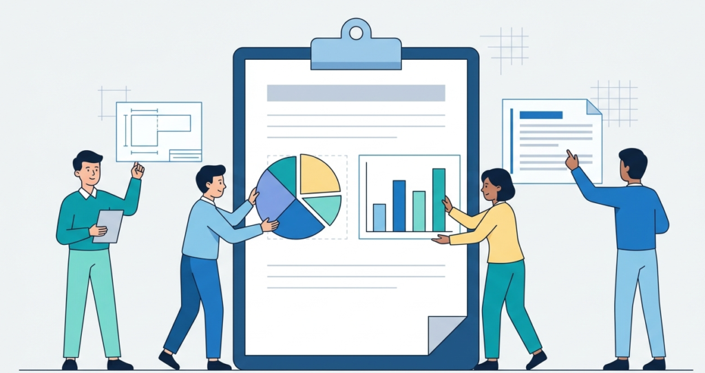
So, how do you build one? Start small. Pick a timeframe, say the last 30 days. Gather all your incident tickets from your help desk or SIEM. Utilizing core mssp reporting dashboard features can make this aggregation seamless. Now, categorize them. Don’t overthink the categories at first. Broad strokes are fine. You’re looking for volume and repetition.
Look at the table below. This is the core of your first analysis. It turns vague worries into specific problems.
| Incident Category | Count (Last 30 Days) | Avg. Time to Resolve | Primary Source/Vector |
| Phishing Email Reported | 42 | 4.5 hours | External Email |
| Malware Detection | 18 | 6.2 hours | Web Download |
| Failed Login Burst | 125 | 2.1 hours | Cloud Admin Portal |
| Unauthorized Access Attempt | 9 | 18 hours | VPN Connection |
See what happens? When you monitor these key performance indicators on your KPIs dashboard, you’re not just saying “we have a lot of phishing.” You’re showing it: 42 times. And those 125 failed logins on the cloud portal? That’s a pattern screaming for a simple fix like geo-blocking or multi-factor authentication.
The “Unauthorized Access Attempt” category has the longest resolution time. That might mean your team lacks playbooks for that specific scenario. The data tells you where to focus your training.
Now, write a few paragraphs about this data. Keep it short. “Our biggest volume driver is phishing, accounting for 42 of 194 total incidents. While resolution is relatively fast, the frequency creates significant workload.
The failed login bursts on the cloud portal are our second most common issue, but they are resolved quickly. The critical pain point appears to be VPN-based access attempts, which take the longest to investigate and contain.” Just like that, you have narrative. You have priority.
From Data to Defense: Closing the Loop
Credits: Technology for Teachers and Students
Collecting data is one thing. Acting on it is where the real security happens. This is the step most teams miss. By customizing mssp dashboard views, teams can ensure these insights remain front and center instead of being filed away while they go back to fighting fires. The report itself must lead to an action.
A single action. Maybe it’s “Implement a quarterly phishing simulation for the sales department.” Or “Block IP ranges from three specific countries at the firewall.”
We learned this the hard way. Years ago, our reports kept showing the same malware variants coming from the same types of shady download sites. We had the data, but we were too busy to act on it. Then a major infection happened, one we’d literally seen coming in the trends.
That was the shift. Now, the most important slide in our monthly review isn’t the chart, it’s the “One Thing We Will Change Next Month” box at the end. It forces a decision. It turns insight into a stronger defense.
Think of it as a feedback loop for your security posture. The incidents happen, you analyze them, you find a root cause, you implement a control, and you measure if it worked.
Did the phishing incidents drop after that training campaign? Did the port scans decrease after the new firewall rule? Your next report will tell you. This is how you build maturity. It’s slow, it’s incremental, but it’s real. You’re not just hoping you’re safer, you’re collecting evidence that you are.
The Human Element: Selling Security Inside Your Organization
Here’s a truth. The best technical report in the world is useless if nobody reads it. Or if they read it and don’t care. Your audience isn’t just the security team. It’s the CFO who signs the checks. The department heads whose teams keep clicking bad links. You need to speak their language. That means less jargon, more business impact.
Instead of “10 SQL injection attempts,” try “10 attempted breaches targeting our customer database.” Instead of “reduced mean time to contain,” say “we now stop breaches 40% faster, limiting potential data loss.” Frame everything around risk, cost, and operational disruption.
Show how addressing the top trend from last quarter saved the company X hours of downtime this quarter. That gets attention. It turns your security work from a cost center into a value protector.
We make it a point to start every executive briefing with a single, plain-language takeaway. “The biggest risk to our company right now is credential theft via phishing.” Then we show the trend line.
“Cybersecurity data often fails to influence executive decisions because technical teams communicate through operational logs rather than risk exposure. Translating technical incident trends into financial and operational risk metrics is a prerequisite for securing organizational alignment.” – ResearchGate
Then we show our plan. This alignment is crucial. When leadership understands the ‘why’ behind your request for a new security tool or more training hours, you get a ‘yes’ more often. Your trend report is your best evidence, your best story. Tell it well.
FAQ
How often should we create an incident trend analysis report?
Start with a monthly cadence. It’s frequent enough to spot emerging patterns but not so often that it becomes a burden. Once the process is ingrained, you can add a quick weekly summary for the team and a deeper quarterly report for leadership. The key is consistency, not complexity.
We’re a small team with a basic toolset. Can we even do this effectively?
Absolutely. Sophisticated SIEMs automate this, but you can start manually with a spreadsheet. The critical factor is disciplined logging, categorizing every incident in a shared system like a help desk ticket. The insight comes from reviewing those categorized tickets regularly, not from the price tag of the software.
What’s the single most important metric to track from the start?
Focus on “Time to Contain.” It measures your operational efficiency from detection to stopping the threat. Improving this number has a direct, tangible impact on reducing potential damage and data loss. It’s a clear indicator of your team’s responsiveness and the effectiveness of your playbooks.
How do we handle pushback from departments that are highlighted as frequent incident sources?
Frame it as collaboration, not blame. Present the data factually, then immediately pivot to support. Say, “Your team faces the most phishing attempts, which shows they’re on the front line. Let’s work together on a targeted training session to build their skills.” This positions security as a partner in solving a shared business problem.
Making Your Analysis Actionable
A report on incident trends is only useful if you act on it. This isn’t just paperwork; it’s the difference between a team that’s constantly reacting and one that’s in control. You move from random alerts to a clear plan. Instead of guessing where you’re weak, you know. Instead of spreading your defenses thin, you concentrate on the most probable threats.
The simple act of a weekly check-in and a monthly review creates a habit of getting better. Start this week. Use a spreadsheet if that’s what you have. Find one pattern. Then take one step to fix it. That’s how you build real momentum, turning a flood of incidents into a stronger, measurable defense. You know what the data shows. The next step is to use it.
Let’s Build Your Perfect Tech Stack
References
- https://en.wikipedia.org/wiki/Trend_analysis
- https://www.researchgate.net/publication/391288406_Effectiveness_of_Incident_Reporting_Tools_in_Ensuring_Patient_Safety_A_Systematic-Narrative_Hybrid_Review